Intro
We continue to explore the connection and abilities of the most popular data sources and your favorite BI tools, and today we will show you the integration of Azure Data Lake Store and Tableau with the help of Dremio. Azure Data Lake Store is a single repository from which you can easily extract data of any type and volume with the necessary speed. It is a perfect place for storing massive datasets and collaborative materials as the corporate-level solutions are used to protect them. Tableau has proved to be one of the most functional and well-developed BI solution. So, let’s look closer how to use these favored tools together.
Assumptions
We assume that you have Dremio and ODBC driver installed; if not, go to Dremio’s deploy page, and pick the installations for your operating system. Also, we will work with Azure Data Lake Store, so you must have Microsoft account to follow this tutorial. If you don’t have one, you can use Free one month trial. Finally, you must have Tableau Desktop installed and configured. We also recommend you read Getting Oriented to Dremio and Working With Your First Dataset and get acquainted with Dremio.
Loading data into Azure Data Lake Store
This time we will analyze French employment, salaries, and population per town based on the Kaggle’s datasets. There are 4 CSV files that we will work with. The first one stores information about different companies in every locality. The second has geographical data, namely longitudes and latitudes and some info about the communities. The third file shows average salaries for different categories of workers. Finally, the last one is about population and demographics.
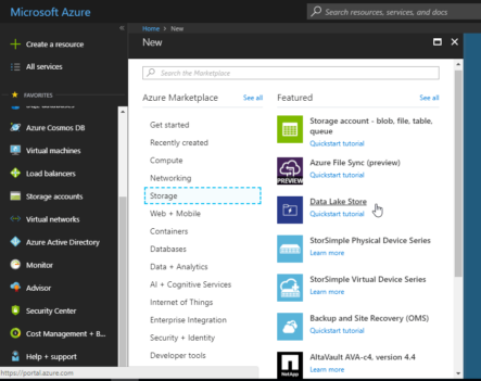
Download all of them and open Azure portal. Then click Create a resource and go to Storage and further to Data Lake Store.

Provide all the necessary information - name the store, select a subscription, resource group, location, and pricing, enable encryption and click Create.
Next, click on this store and go to Data explorer, then click Upload, select and add the downloaded from Kaggle files.

After the uploading, you will see all the tables.
Connecting Azure Data Lake Store to Dremio
Now we need to connect Azure Data Lake Store to Dremio. For that, we have to make some additional configurations. First off, in the Dremio UI click New Source and select Azure Data Lake Store. As you see, you must provide some information from Azure.

Let’s go step by step.
1 - Resource Name is the name of your Data Lake Store.
2 - Oauth 2.0 Token Endpoint. Go back to Azure Portal and click on Azure Active Directory on the left. Then select App Registrations and click on Endpoints.
Note down Oauth 2.0 Token Endpoint. Copy this information to the New Source page in Dremio.
3 - Application ID. Click New application registration. Select a Name, choose Web app / API as application type and enter a Sign-on URL. This URL can be a valid arbitrary URL. Click Create.
Once created, click on the registered app, and there you will find your Application ID. Again, fill this information in Dremio.
4 - While in the registered app, select Keys under API Access. Then enter key description and select the duration. After you save this, you will get a value which is a password for your Azure Data Lake Store source in Dremio. Save it as you will need the password later.

After this, you also need to grant Azure Data Lake Store access. Click on Access control (IAM) and then choose Add.

Select Owner as the Role and find the name of the application you registered above. Click Save.

Now, we can connect to Azure Data Lake Store in Dremio.
The last step, after the source has been successfully created, is to go back to the source configuration and add the property with the name fs.adl.impl.disable.cache and the value false. You will need to provide the password again.

Finally, restart the cluster. You will see a pop-up warning window about metadata impacting change. Click Confirm.

Data curation in Dremio
Let’s begin the data preparations that will be needed for the visualization. Hover over the first CSV file and click on the configuration button on the right.

You will see the Dataset Settings menu that allows you to make all the necessary configurations. So, we choose the Text (delimited) format for our file with LF Unix/Linux line delimiter and select to extract field names among the options.

Now, after you click Save, you will see the created dataset. We want to configure all 4 datasets, name them companies, geodata, salaries, and population and then save them to the French space to be able to share them with other users. But at this step, we also need to convert the variables we will work with to the appropriate data types. In particular:
- SEXE, AGEQ17_80, and NB convert to integer in population dataset,
- longitude, latitude to float in geodata,
- SNHMF14 (mean net salary for women), SNHMH14 (mean net salary for men), SNHM14 (mean net salary) float in salaries, and
- E14TST (total number of firms in the town), E14TS500 (number of firms with more than 500 employees in the town) in companies dataset.
After saving, we have 4 datasets.

As we want to use map visualization to achieve greater visibility, we need to join the salaries and geodata datasets. Open the salaries dataset and click Join.

Then select geodata dataset from the French space and click Next.

Now, we join by CODEGEO and code_insee variables by dragging CODEGEO from the fields on the left and code_insee from the right.

Then click Save as, name this dataset salaries_with_geo and again place it in the French space.
Note, that SQL editor automatically writes the following:
SELECT nested_0.LIBGEO AS LIBGEO, nested_0.SNHM14 AS SNHM14, nested_0.SNHMC14 AS SNHMC14, nested_0.SNHMP14 AS SNHMP14, nested_0.SNHME14 AS SNHME14, nested_0.SNHMO14 AS SNHMO14, nested_0.SNHMF14 AS SNHMF14, nested_0.SNHMFC14 AS SNHMFC14, nested_0.SNHMFP14 AS SNHMFP14, nested_0.SNHMFE14 AS SNHMFE14, nested_0.SNHMFO14 AS SNHMFO14, nested_0.SNHMH14 AS SNHMH14, nested_0.SNHMHC14 AS SNHMHC14, nested_0.SNHMHP14 AS SNHMHP14, nested_0.SNHMHE14 AS SNHMHE14, nested_0.SNHMHO14 AS SNHMHO14, nested_0.SNHM1814 AS SNHM1814, nested_0.SNHM2614 AS SNHM2614, nested_0.SNHM5014 AS SNHM5014, nested_0.SNHMF1814 AS SNHMF1814, nested_0.SNHMF2614 AS SNHMF2614, nested_0.SNHMF5014 AS SNHMF5014, nested_0.SNHMH1814 AS SNHMH1814, nested_0.SNHMH2614 AS SNHMH2614, nested_0.SNHMH5014 AS SNHMH5014, nested_0.CODGEO AS CODGEO, join_geodata.code_insee AS code_insee, join_geodata.EU_circo AS EU_circo, join_geodata."code_région" AS "code_région", join_geodata."nom_région" AS "nom_région", join_geodata."chef.lieu_région" AS "chef.lieu_région", join_geodata."numéro_département" AS "numéro_département", join_geodata."nom_département" AS "nom_département", join_geodata."préfecture" AS "préfecture", join_geodata."numéro_circonscription" AS "numéro_circonscription", join_geodata.nom_commune AS nom_commune, join_geodata.codes_postaux AS codes_postaux, join_geodata.latitude AS latitude, join_geodata.longitude AS longitude, join_geodata."éloignement" AS "éloignement"
FROM (
 SELECT CODGEO, LIBGEO, SNHM14, SNHMC14, SNHMP14, SNHME14, SNHMO14, SNHMF14, SNHMFC14, SNHMFP14, SNHMFE14, SNHMFO14, SNHMH14, SNHMHC14, SNHMHP14, SNHMHE14, SNHMHO14, SNHM1814, SNHM2614, SNHM5014, SNHMF1814, SNHMF2614, SNHMF5014, SNHMH1814, SNHMH2614, SNHMH5014
 FROM French.salaries
) nested_0
INNER JOIN French.geodata AS join_geodata ON nested_0.CODGEO = join_geodata.code_insee
Now let’s look at the population dataset, where total population of every city is divided by many indicators. Each line for the city shows the population of a certain group of people who differ in age, gender, and status in the family. The situation in the family will not interest us, therefore, we can remove this variable and generalize these groups to those that differ only in gender and age. For that, we can group our data by LIBGEO, SEXE, and AGEQ17_80 variables, and as a measure, we will use а Sum(NB). So, click Group by and grad these 3 dimensions from the fields on the left and set the respective measure.

The SQL Editor looks like following:
SELECT LIBGEO, AGEQ80_17, SEXE, SUM(NB) AS Sum_NB
FROM French.population
GROUP BY LIBGEO, AGEQ80_17, SEXE
Now save it as a new dataset called population_grouped.
At the end of our data preparations, we have 4 primary datasets and 2 which we have created.

Building visualizations in Tableau
Once you have your ODBC driver installed, we are ready to connect to Tableau. To begin with, open salaries_wih_geo dataset and click on the Tableau button at the top of the page.

After that, a tds file will be downloaded to your computer. This is a configuration file that makes it easy to launch Tableau connected to this virtual dataset over ODBC.
Once you open that file, it will launch Tableau connected to your virtual dataset. If you’re on Windows, you should be prompted to log in to Dremio:

If you’re on Mac, you’ll be prompted to log in after you start to access the data. Enter your Dremio credentials.
Now, in the bottom left corner, click on Sheet 1 where we will start building visualizations.

By default, Tableau makes all the numerical variables measures; however, let’s convert latitude, longitude, SNHMF14, SNHMH14, and SNHM14 to dimensions by dragging them into the list of dimensions.

Next, drag the longitude and latitude into rows and columns shelves on the sheet respectively and choose map as the type of visualization. Then let’s add SNMH14 to the marks by color.

However, this map turned out to be not very informative. A much more interesting indicator will be the ratio of the average salary among women to the average salary among men. To visualize this, we need to create a new variable called Ratio. Right-click the mean net salary for women SNMHF14 and select to create a calculated field.

Next, define the variable as [SNHMF14] / [SNHMH14] an save it. Then make it a dimension and use it as a mark by color. In addition, the standard coloring is not very informative, so we change it to the Green-Gold palette.

Then click on Assign palette. Now, the picture has changed. Despite the great density of points, some regularities can be traced. Yellow dots mean the smaller ratio and the green ones represent a ratio close to one.

Furthermore, let’s add the possibility to look at the name of the city for the particular point. To do this, we add the variable LIBGEO as a tooltip to Marks.

By zooming the map, we see that the yellow-green spot is centered around Paris.

Now if we want work with some other dataset, we do not need to perform all the connection manipulations as with salaries_with_geo. We can simply enter the name of the required dataset in the Tables window and load it (in this case just drag it to the central part of the screen).

Let’s go back to the worksheet and create a bar chart. We convert all the variables except Sum_NB to dimensions and drag SEXE, AGE, and Sum_NB to rows and columns section. Select the Stacked Bar Chart as the type of visualization.

This is the visualization that we got. As you see, the difference between males and females gets bigger with the growth of age.

Finally, let’s upload companies dataset just like we did with population_grouped. There are many interesting visualizations in Tableau, so we want to explore packed bubbles for example. Add LIBGEO, E14TST (total number of firms in the town), E14TS500 (number of firms with more than 500 employees in the town) to rows and columns and select this type of visualization. As a result, you will get the following picture:

Conclusion
In this tutorial, we showed how you can easily solve the Tableau visualization tasks with the data from Azure Data Lake Store using Dremio. Dremio allows you to seamlessly connect and structure the data with the help of SQL in the form when you can get any query you need. Moreover, you can perform analytics in the live format getting refreshed data whenever you need.
All in all, Dremio provides many other useful features which you are welcome to explore.
Try Dremio’s Interactive Demo
Explore this interactive demo and see how Dremio's Intelligent Lakehouse enables Agentic AI


