31 minute read · June 14, 2019
Building a ML Classifier with ADLS Gen2 and HDFS

Intro
HDFS is a well-known distributed file system based on the Apache Hadoop project. It allows storing large amounts of data safely in a highly performant system which can scale on demand. With the help of HDFS data, consumers can work with really big data distributed between nodes in a cluster. Dremio provides support for connecting to HDFS and using the data stored there.
Azure Data Lake Storage Gen2 is a relatively new component of Microsoft Azure platform. It can be considered as a higher level upon both Azure Blob Storage and Azure Data Lake Storage Gen1. There are many different improvements in this version of storage, including boosts in performance, security, usage convenience, optimization, cost-effectiveness, and more.
Dremio (3.2) supports Azure Data Lake Storage Gen2. In this article, we are going to show how to load data into HDFS and ADLS Gen2, then how to connect these sources to Dremio, and how to perform data curation. After that, we will use the curated data to create a machine learning model. We will use the Banknote Authentication Dataset.
The task is to classify whether the banknote is fake or not based on such features as variance, skewness, curtosis, and the entropy of the image. We have split the dataset to load one part to ADLS Gen2, while the other to the local HDFS. We decided to store data about variance and skewness in ADLS Gen2. HDFS will include data about the curtosis, entropy, and the class label.
Assumptions
In this tutorial, we assume that you have installed:
- Dremio 3.2
- Apache Hadoop
- Azure account
- Python 3.6
- Pyodbc
- Dremio ODBC Driver
- Pandas, Scikit-learn, Plotly packages
- Jupyter Notebook
- Ubuntu OS
Note that it is possible to reproduce our work using a slightly different set of prerequisites, so it is only the informative list.
Preparing Azure Data Lake Storage Gen2
First thing that you need to do is to create a resource group. Open Azure Portal in your browser and log in. In the left-side menu, find Resource groups. Then press the Add button. In the opened form, enter the name of the resource group, select the subscription type and region. Click Review + Create. You will see the following summary, and if everything is okay, you can confirm the creation of the new resource group.

Now you should create a new storage account. Click on All services, then find Storage and pick Storage accounts:

On the opened window, press the Add button:

Then, you have to fill the following form:

You can see that we selected the resource group banknotes_fake which we created earlier. Also, we give the name adlsgen2dremio to the storage account we want to create. The location should be set as West US 2. Check the Account kind field, it should be equal to StorageV2 (general purpose v2). After that, click on the Next: Advanced > button.

In the Advanced tab, it is important to click Enabled radio button near the Hierarchical namespace of the Data Lake Storage Gen2. Then you can press Review + create button, check if everything was filled as you need and confirm the creation of the Storage account. You should wait a while, and the following message should appear which means that the deployment was successful:

Inside the storage account, you will see the following picture:

Note, that there is Data Lake Gen2 file systems in the list of services, which means that our storage instance is really the Azure Data Lake Storage Gen2.
To be able to load our dataset into ADLS Gen2, we need to create a file system first. So, click on this service in the list of services (look at the image above). In the opened window, click on the button + File system and give it a name (we decided to name it adlsgen2dremio).

Now, everything is ready for loading the data into ADLS Gen2. There are several ways to do this. As we have only one file to upload, we decided to use a graphical user interface - Azure Storage Explorer. To start using this application, you should download and install it. Note, that for the correct work of the application, you should also have .Net Core 2.x installed.
After you run Azure Storage Explorer, you will see that it is pretty simple to upload a file. In the left-side navigation structure, you should go to your storage account (adlsgen2dremio in our case). You will be able to press an Upload button, browse your local filesystem and select the needed file (banknotes_first.csv).

Connect Azure Data Lake Storage Gen2 to Dremio
First, select Azure Storage among the sources:

The window New Azure Storage Source will appear. In this window, you need to enter some parameters for connection with ADLS Gen2. Give this source a name (adls_gen2 in our case) and specify the Storage account name (adlsgen2dremio). Select StorageV2 option in the Account Kind section.

Without proper authentication, you will not be able to connect. So, you need to specify the Shared Access Key. Go to the Settings section of the Storage account and click Access Keys. In the opened window (look at the screenshot below), you should be able to find and copy the value for the key1 parameter. This is what you need to enter in the appropriate field in Dremio.

After the connection is established, you will see your source in the list of sources in the left side of the window:

If you browse the filesystem, eventually you will find the uploaded file with the dataset - banknotes_first.csv:

You can open this file in a preview mode, check how it looks like and save the dataset:

Preparing HDFS
Just 3 simple steps should be done to load the banknotes_second.csv file into HDFS:
- 1. Start HDFS cluster. Go to sbin directory in your Hadoop folder and run start-dfs.sh script.
~/<hadoop_folder>/sbin$ ./start-dfs.sh
- 2. Create banknotes folder in HDFS with the specific path (-p flag means that HDFS should create a given path if it doesn’t exist):
hadoop fs -mkdir -p /user/dremio/banknotes
- 3. Go to the local directory where your banknotes_second.csv file is located and copy this file into the HDFS directory created on the previous step:
hadoop fs -put banknotes_second.csv /user/dremio/banknotes/
After completion of these steps, you should have banknotes_second.csv file in your HDFS filesystem. To check this, you can issue the following command:

This will show all the files inside the /user/dremio/banknotes directory in HDFS.
Connect HDFS to Dremio
In the New HDFS Source window, specify the name of the source (hdfs_local in our case), NameNode Host (127.0.0.1 in our case, because we run HDFS on our local machine), port number (54310). You can find the port number by visiting this page: http://localhost:50070/ (look at the image below).

After you fill all the needed parameters, the window should have the following look:

Click the Save button and wait while the connection is established. If no problems are raised, you should see hdfs_local in the list of sources and the file banknotes_second.csv in the middle part of the window:

Data curation in Dremio
Let’s now transform our data inside Dremio. First what we need to do is to create a workspace where we are going to store the joined dataframe. To create a space, click Add space button on the homepage of the Dremio GUI. Then, in the opened window, enter the name for new space:

To start joining data, go to one of the datasets (for example, banknotes_first.csv) and click the Join button:

Select the dataset with which you want to join the current dataset (banknotes_second.csv in our case):

After clicking the Next button, you have to specify the columns on which the dataframes should be joined (we selected A columns because we have indexes in both tables in these columns).

As a result, we got the following joined table:

That columns are redundant for further analysis, so we want to remove them. To do this, click the little arrow button near the name of the needed column and choose Drop option:

Also, you can notice that the first line in our dataframe is the product of importing and actually contains the names of the columns. So, we need to rename columns first and then delete the first row of our dataset. It is easy to perform renaming in Dremio. You can click on Rename in the dropdown menu and enter a new name for the column. Another option is to click on the current name of the column, wait until the cursor starts blinking and specify the new name. We perform the renaming operation for each column in the dataset.
The more interesting thing is how we remove the first row from the dataframe. We will start from the same dropdown menu, which we want to call from the context of the class column. We select the Exclude option, like on the image below:

Then, we select the value we want to exclude (class) and click Apply. This action should drop the entire row where the specified value exists.

Next, we want to convert the columns types from string to float, except the class column, which we will convert from string to integer. To do this, click on the little Abc symbols near the name of the column and select the needed type:

It is important to say, that Dremio provides a preview for each transformation before actually performing it. For example, when converting types, if you wait a few seconds, the new column will appear near the old. This makes the process of checking whether everything is okay more convenient.

Also, there are several options during the preview step. You can decide how to deal with the values which cannot be converted to float. The new column can be created without dropping the source field. You can even give the new name to the new column, which will be different from the name of the source column.
The last thing we want to show is how to sort a dataframe in Dremio. We will sort the class column in descending order:

Now we have to save all the changes. Click the corresponding button (Save as) in the top right part of the screen. We want to save the curated dataset with name adls2_hdfs_curated in the adls2_hdfs space.

The final version of our curated dataset looks like the following:

Classification with scikit-learn
Now we are ready to start the creation of the classification machine learning models in scikit-learn. As we already stated, we will use the Jupyter Notebook environment. Nevertheless, you can build models in the simple Python files.
To begin with, import the needed libraries and modules:
import pandas as pd
import numpy as np
import itertools
import pyodbc
from sklearn.metrics import accuracy_score
from sklearn.metrics import f1_score
from sklearn.metrics import roc_auc_score
from sklearn.metrics import confusion_matrix
from sklearn.model_selection import train_test_split
import plotly_express as px
import matplotlib.pyplot as plt
%matplotlib inline
Now we need to connect to Dremio and import the curated dataset:
host='localhost'
port=31010
uid ='username'
pwd = 'password'
driver = '/opt/dremio-odbc/lib64/libdrillodbc_sb64.so'
cnxn = pyodbc.connect("Driver={};ConnectionType=Direct;HOST={};PORT={};AuthenticationType=Plain;UID={};PWD={}".format(driver,host,port,uid,pwd),autocommit=True)
sql = "SELECT * FROM adls2_hdfs.adls2_hdfs_curated"
df = pd.read_sql(sql,cnxn)
It is important to look at the imported dataset and check its dimension:

The describe() method of the dataframe object helps understand some important statistics about the data:

The statistics above are useful but it is not enough to understand the structure and distribution of the data. That’s why visualization is one of the core concepts in Data Science. So, we want to build several graphs during the exploratory data analysis (EDA) which should help us take a closer look at the dataset.
There are several good plotting libraries available in Python. In this article, we want to demonstrate you the basics of the Plotly Express library which is open sourced recently and it seems like it is a very convenient and powerful tool for EDA.
Installation process is as simple as issuing the following command from your Terminal:
pip install plotly_express
Now, we use only one line of Python code in order to build the scatter matrix with Plotly Express:
px.scatter_matrix(df, dimensions=["variance", "skewness", "curtosis", "entropy"], color="class")
We pass df as the argument to the scatter_matrix() function as well as the list which should be used for scatter plots building. The color argument is used to specify which column of the dataset will be used to separate data points by different colors on the plot. Here is what we generated after the execution of the code above:

This plot allows us to understand how the classes (1 and 0) are distributed. In many scatter plots we have noticed that the classes are quite separable. So, it should not be very hard for future classifiers to detect the correct decision surface.
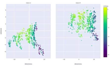
Plotly Express can be used to explore the distribution even deeper. For example, let’s visualize the correlation between variance and skewness separately for “0” and “1” class. Also, we set the color grade to depend on the value of entropy for the given data point. Here is the code:
px.scatter(df, x="skewness", y="variance", color="entropy", facet_col="class",

           color_continuous_scale=px.colors.sequential.Viridis)
And here is the graph:

Also, let’s look at how the distribution histograms vary depending on the class:
px.histogram(df, x="variance", color="class", marginal="rug", hover_data=df.columns,
color_discrete_map={
          0: px.colors.sequential.Magma[8], 1: px.colors.sequential.Magma[4]
      })
As we can see, the distribution is really different.
To understand whether we need to balance the classes, we should build a histogram of the target variable (class) distribution:
px.histogram(df, x="class", color="class")

The classes are relatively balanced, so we don’t need to perform any class balancing.
One more plot we want to build is the scatter plot of the dependency between variance and entropy where the size of the marker on the plot depends on the value of the curtosis for the given data point. But there is a problem - we have negative values for curtosis in our dataset, while Plotly Express requires the values greater than or equal to zero. So, we decided to perform scaling on the range [0;1] for the entire dataset. This preprocessing technique (scaling) is recommended generally prior to building machine learning models. However, in our case, we will not use scaled values as a training set, because all values originally lay in approximately the same range. So, the scaling below is performed exclusively for building the graph.
The code below imports MinMaxScaler from the sklearn package and then uses it for scaling. The scaled dataset is stored in the df_scaled variable.
from sklearn.preprocessing import MinMaxScaler
scaler = MinMaxScaler()
df_scaled = pd.DataFrame(data=scaler.fit_transform(df),
                         columns=['variance', 'skewness', 'curtosis', 'entropy', 'class'])
Here is how our dataset looks after scaling:

You can notice that all the features lay in the range from 0 to 1. Now, we can use the following code to generate the desired graph.
px.scatter(df_scaled, x="variance", y="entropy", size="curtosis", color="class", log_x=True, size_max=30)

Finally, we can start building classification models. We will try 6 different algorithms: logistic regression, K nearest neighbors, support vectors classifier, random forest classifier, gradient boosting classifier, and simple neural network. All algorithms can be implemented using sklearn package, so, let’s import the needed objects:
from sklearn.linear_model import LogisticRegression
from sklearn.neighbors import KNeighborsClassifier
from sklearn.svm import SVC
from sklearn.ensemble import RandomForestClassifier
from sklearn.ensemble import GradientBoostingClassifier
from sklearn.neural_network import MLPClassifier
We need to separate the target variable from the features (independent variables), and then split the dataset into training and test parts:
X = df.drop(columns=['class'])
y = df['class']
X_train, X_test, y_train, y_test = train_test_split(X, y, test_size=0.3, random_state=42)
Let’s start from the logistic regression:

Wow, the performance is fantastic! We have a 99% accuracy, 99% F1-score (this metric is better than accuracy because it takes into account both precision and recall), and even the area under the ROC curve is almost ideal. When we said that the conducted EDA demonstrated that classes are well separable, we didn’t know that the results would be of such high quality. Let’s move further and train the K-nearest neighbors model:

It seems that this is the perfect algorithm which produces the ideal results. Maybe we estimate the model quality in the wrong way? Let’s try to perform cross-validation. This is the process where N different models are trained each time on a subsample of the original training set and tested on the rest of the data in the dataset. Cross-validation is considered as a reliable indicator of model quality.

We split the dataset into 5 subsamples, so each time we will train the K-nearest model on the subsample from 4 chunks of data and evaluate it on the 5th subsample. As you can see, the quality is the same - 100%. Probably this classification is a very easy task for the machine learning models. Let’s briefly look at other models:

As you can see, the results are very high for all used algorithms. The neural network is very simple (only 1 hidden layer with 8 neurons in it), but even this network is able to achieve the perfect model’s quality.
Conclusion
In this article, we showed how to use data from Azure Data Lake Storage Gen2 and HDFS to build the machine learning classification model in sklearn. The task was to predict whether the banknote is fake based on the parameters of the banknote image. In Dremio, we joined the data and performed its curation (dropped some columns and rows, renamed columns, changed their types, sorted values, etc.). The classes (1 and 0) in the given dataset are separable very well, so it was not hard to train a range of perfect classifiers.
We hope you enjoyed this tutorial, checkout the rest of our tutorials and resources page to learn more about how you can gaining insights from your Azure data, faster, using Dremio.
Try Dremio’s Interactive Demo
Explore this interactive demo and see how Dremio's Intelligent Lakehouse enables Agentic AI


